Truck App for Tesoro

01 Background
Truck App is a mobile app that empowers the Truck crew members to manage their schedule, stock and fulfill offer for our customers. It’s also the tool for our crew to greet and delight our customers in a personal way. It is the key to make sure our customers have a friendly surprising experience in the truck.
Amazon
TIME
2017-2018
ROLE
Sr. UX Lead
The problems of current experience
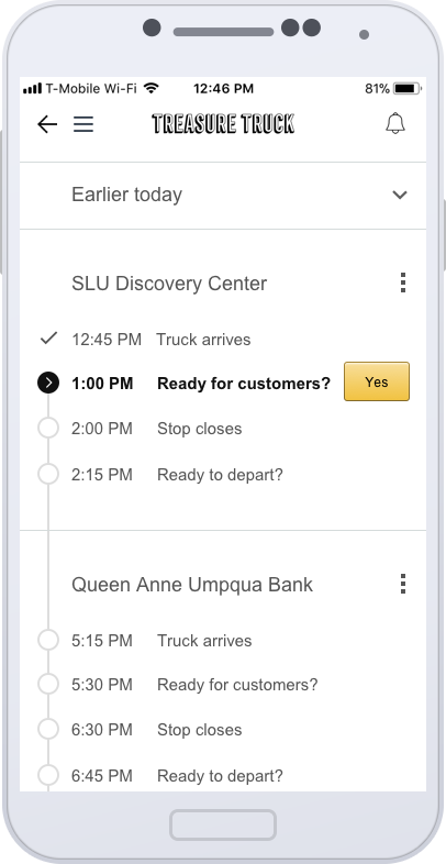
The slideshows on the right demonstrate the previous design for Truck App before I worked on it. The problems of this design are:
- not optimized for the key tasks
- not considered the different background of the users
- lack of extensibility
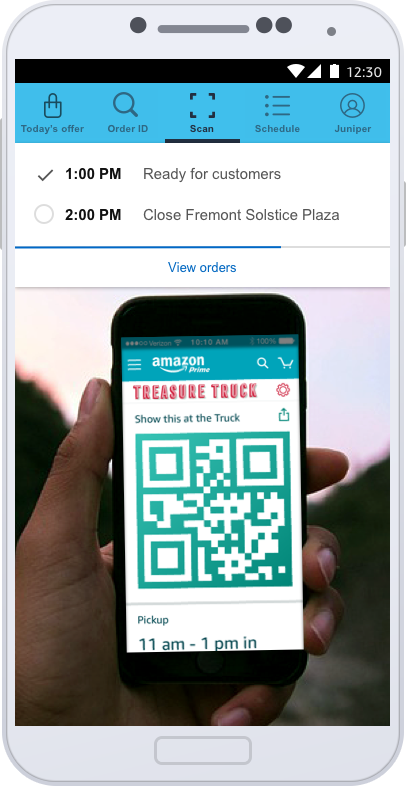
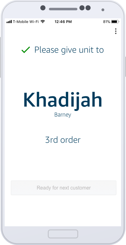
There are three different types of users for truck app: Area manager, Market associate and Temporary labor force. Most of the tasks in the app are only related with Area Manager. The key task in an offer day is to scan and fulfill order for end customers. The previous design doesn’t optimized for this key task. The blue navigation tabs on the top did provide quick shortcut to less frequently tasks. However, it is also a distraction for market associate and temporary labor. Another wrong assumption of previous design is all the users will have appropriate training before they use. The reality is the temporary labor often start to use Truck App to serve our customers after 5 minutes quick demo. Once in Portland, 119 items was given to our customers without being able to charge due to the wrong operation within Truck App. Improving the design can avoid such error in future.
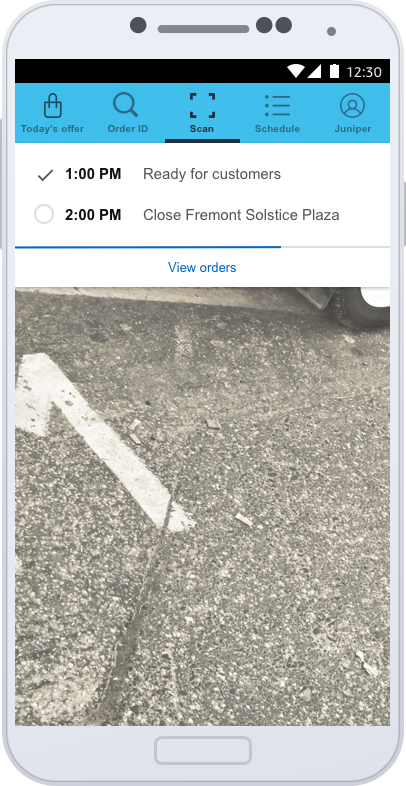


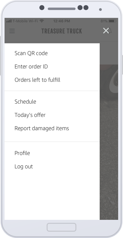
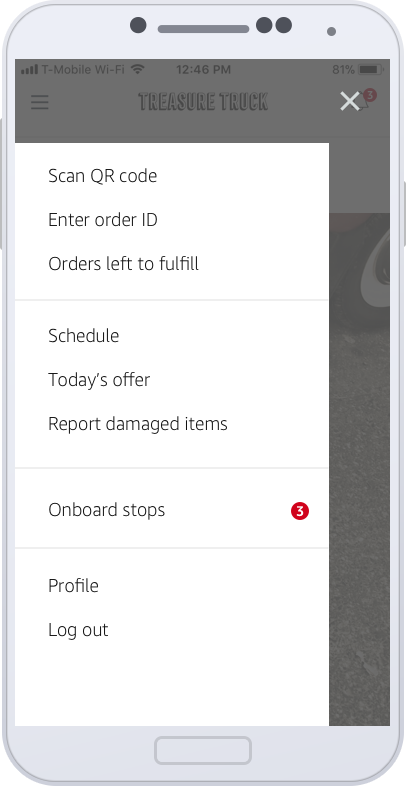
02 New navigation
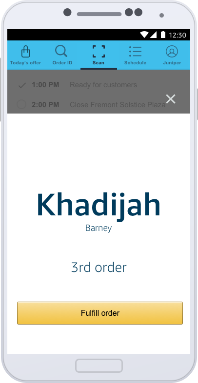
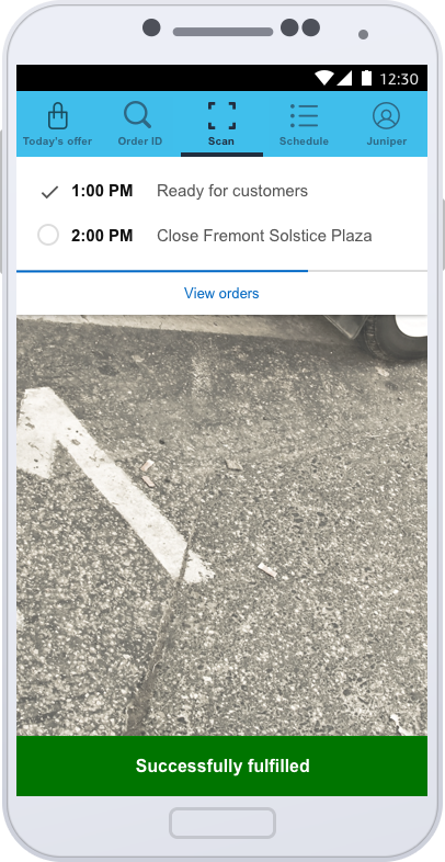
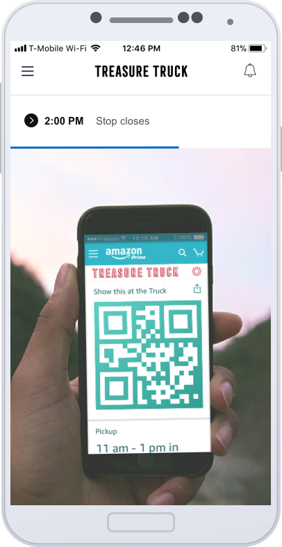
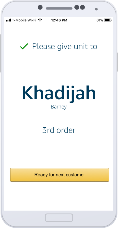
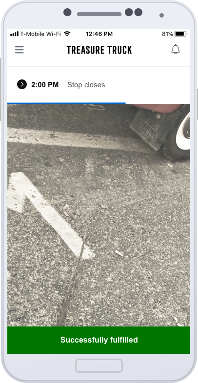
The slideshow below showing the new design for Truck App.The new navigation use typical hamburger menu. The default homepage is Scan QR code, which is the most important task on an offer day. The only other thing the users can see is next event in the schedule. The users can access all other features via the hamburger menu.
03 View inventory
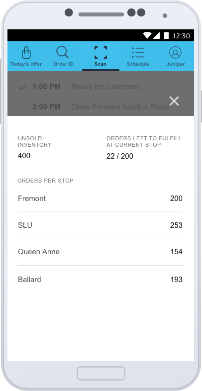
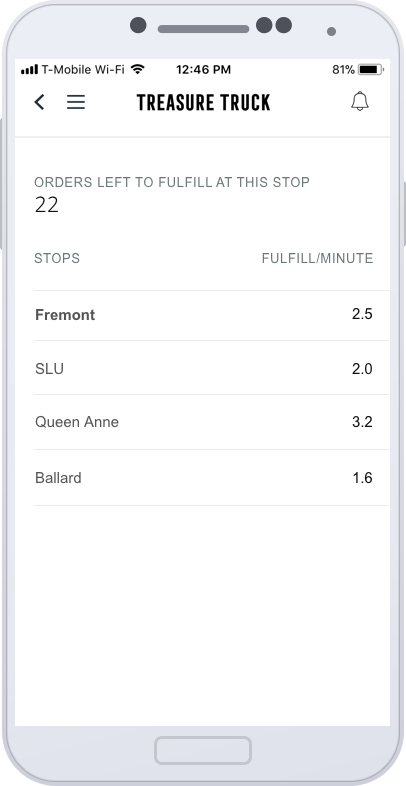
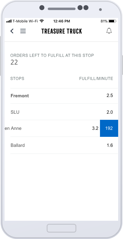
View inventory is a feature which allow the field crew on the truck to view the orders waiting for picking up in different stops, so that they can better plan for their day, such as when is a good time for lunch break. The entry point for this feature was a link on scan page, which could be distraction to our crew members. The data on this screen is high confidential. The previous design is not data safe. In the scenario where Truck App is used, the users can easily peak at the screen of our field crew. So the new design was created to address this concern. Instead of showing orders for all stops directly, it is shown the orders per minute. When the users swipe on the row, the orders for that stop will be shown. The orders per minute in many cases can be more useful than the order number.

Old design
New design
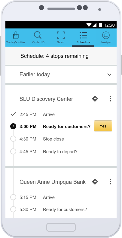
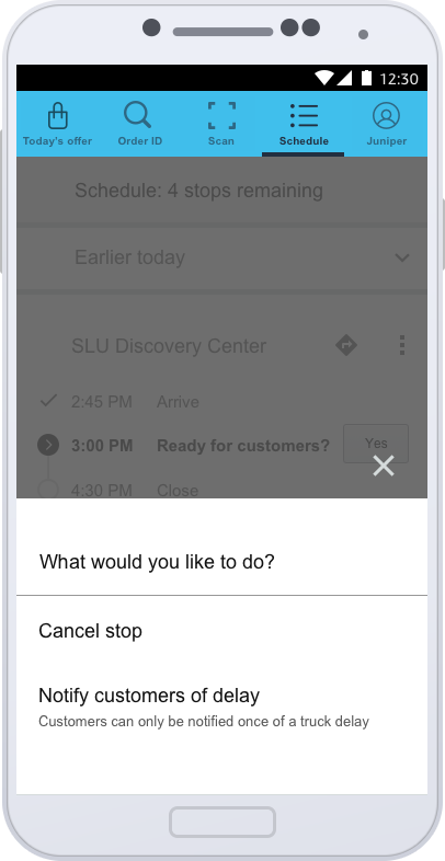
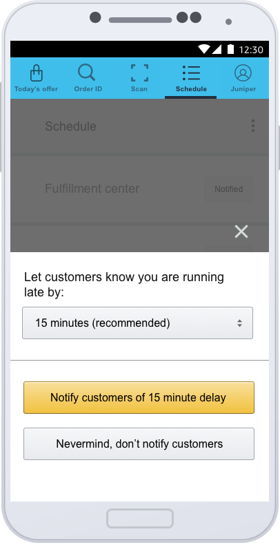
04 Stop delay and cancellation
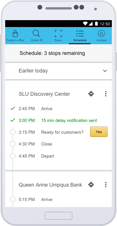
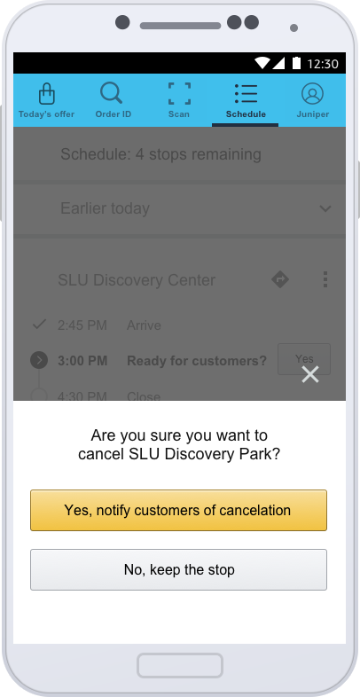
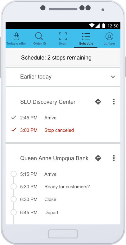
Old design
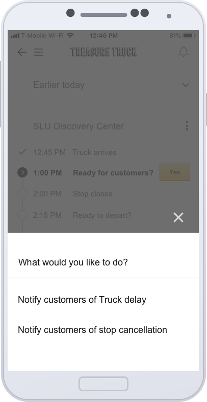
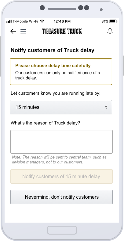
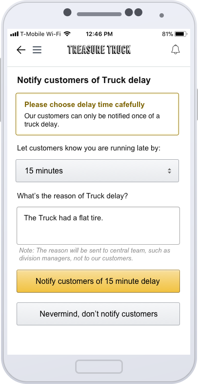
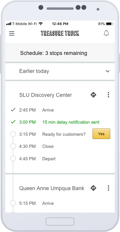
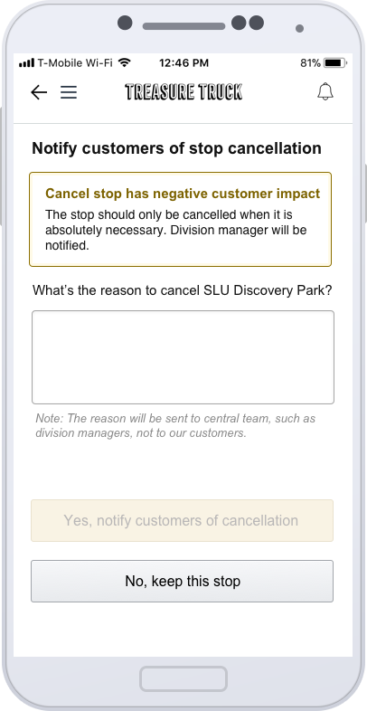
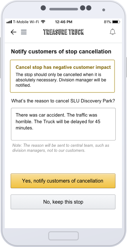
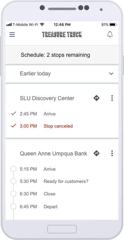
New design
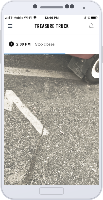
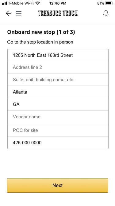
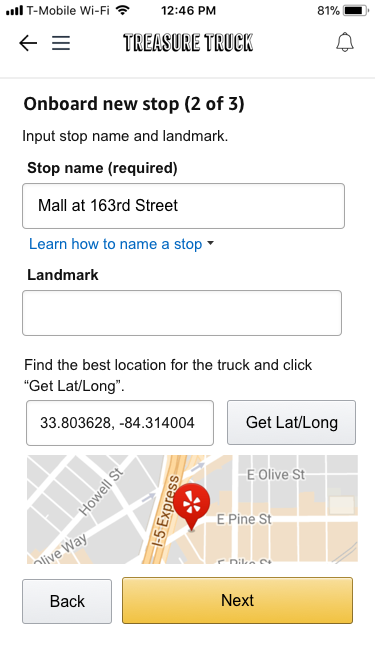
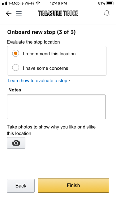
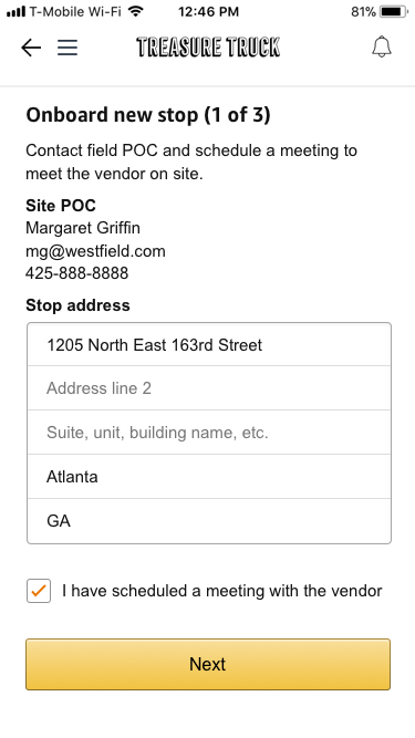
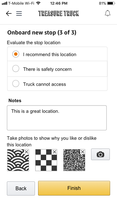
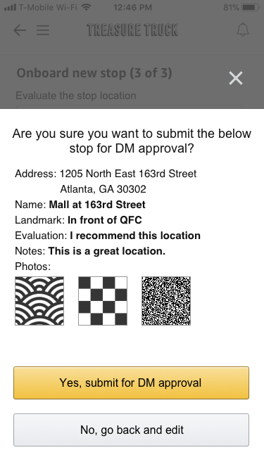
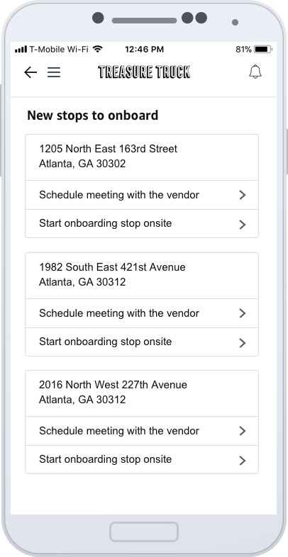
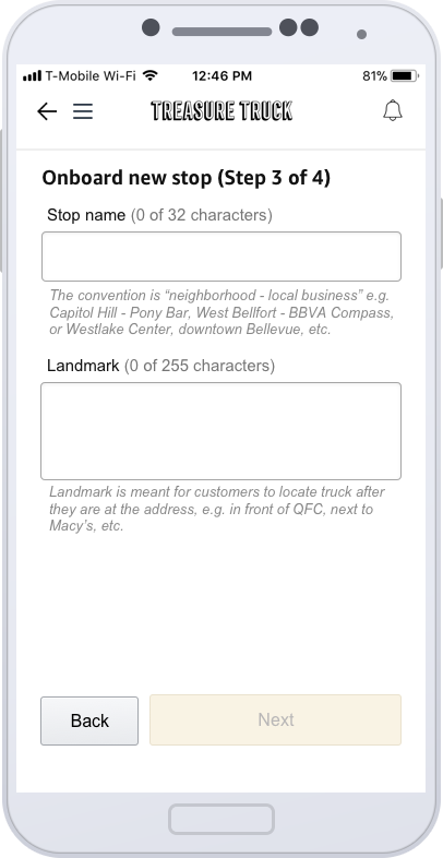
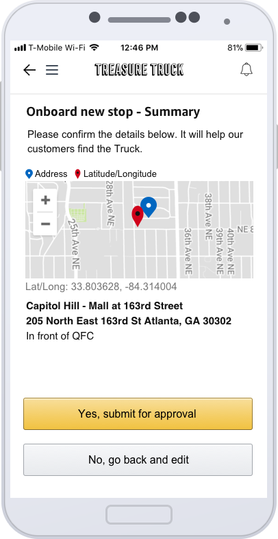
05 Stop location onboarding
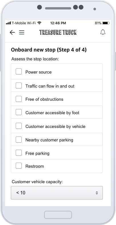
Stop location is one of the key factors to the success of our business. Bad stop location will have low sale through rate and compromise the fun experience for our customers. After real estate team sign contract with our vendor for stops, the field team need to visit the potential stop in person and evaluate the stop. The field team need to verify a series of key things, such as whether the stop is accessible for the truck, whether the stop can be access by foot, what the Lat/Long is for the stop, etc. Previously, the field team member visited the stop location first to take note on his notebook and to send email to real estate team. There are a lot of drawback for this manual process.
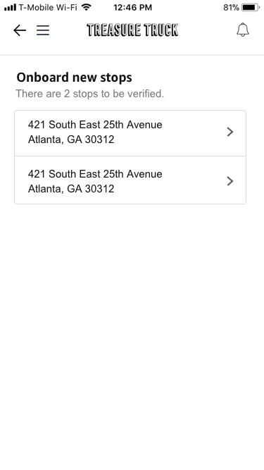
Stop location onboarding feature in Truck App is designed and developed to address this issue. Truck App is the app which our field team use every week. We want the field team to use the same app to finish stop onboarding. This design involves three teams: truck app team, field team and real estate team. The below are the user flow and the stop status in each step.
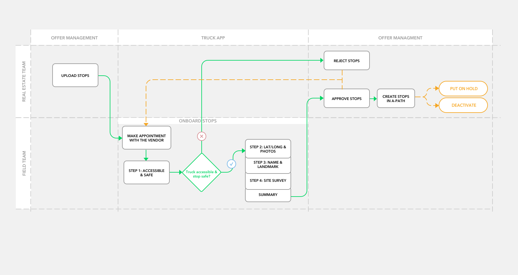
User flow
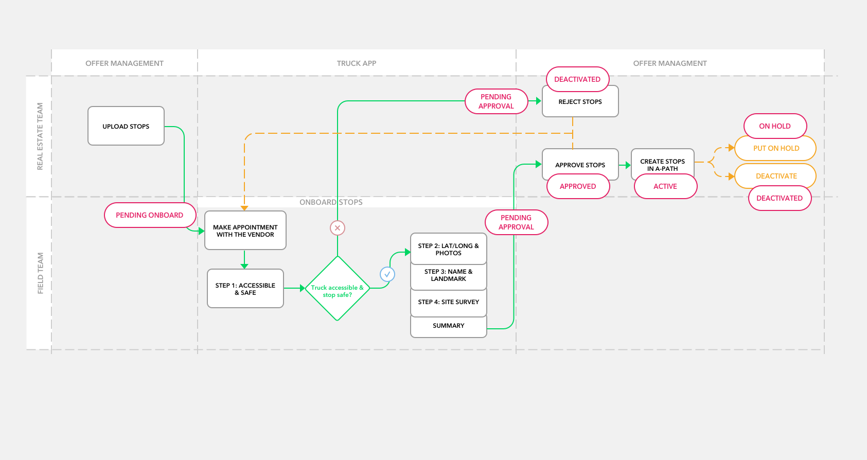
Stop status
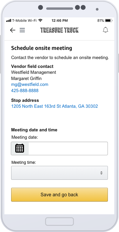
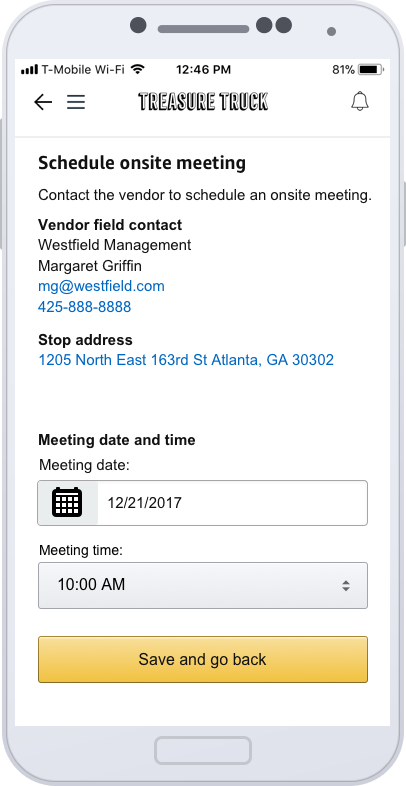
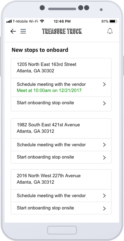
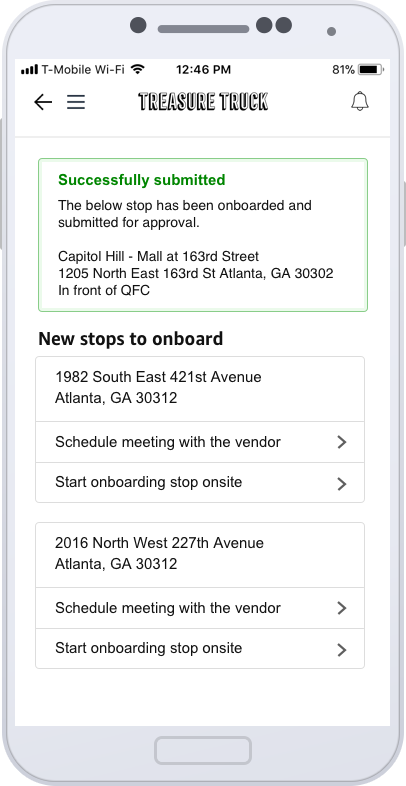
From the user flow above, we can see the typical workflow of stop onboarding. Real estate team will negotiate a deal with the vendors and sign contract in SalesForce. Then, real estate team member will upload the stops in offer management. Once a stop has been added to Offer Management, it will automatically be assigned to Area Manager for each truck. The Area Manager will get notification inside Truck App. They need call or email the vendor to make an appointment. They come to the stop location and start onboarding the stop using Truck App.
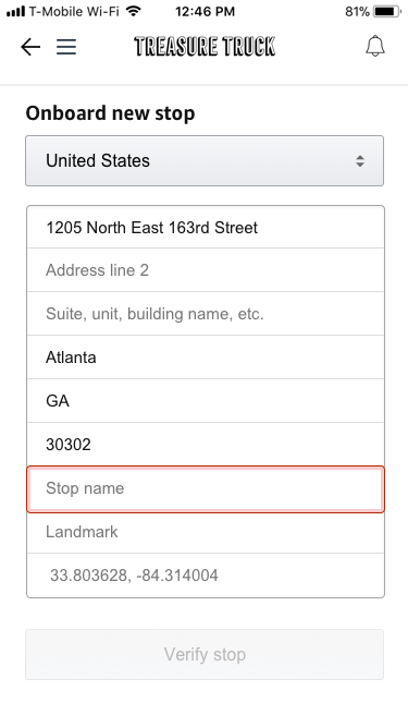
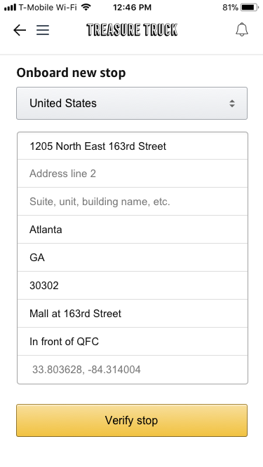
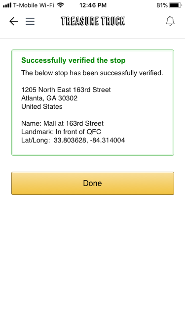
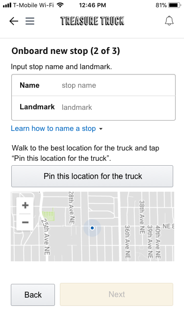
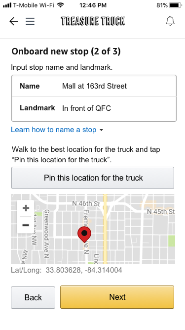
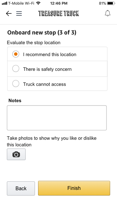
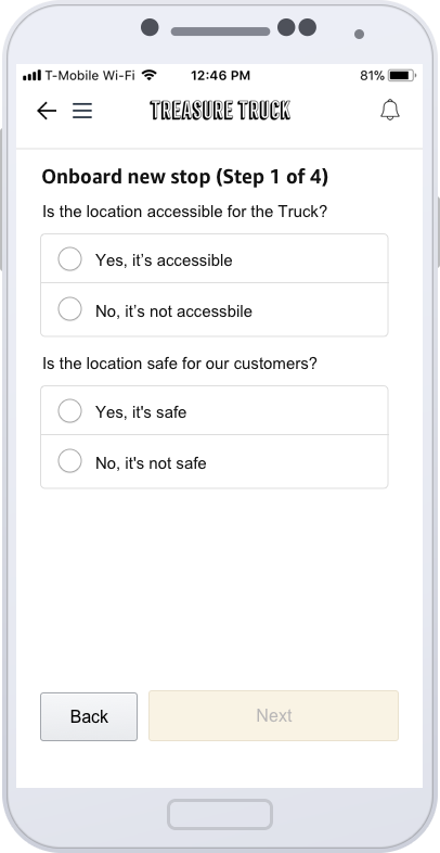
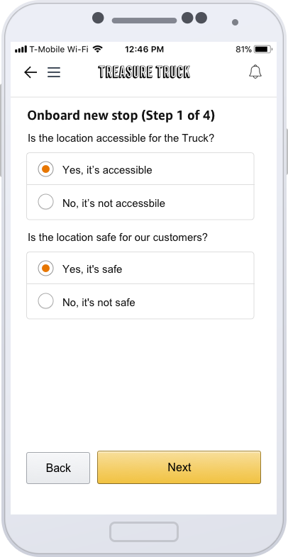
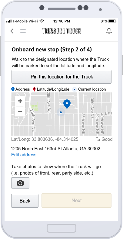
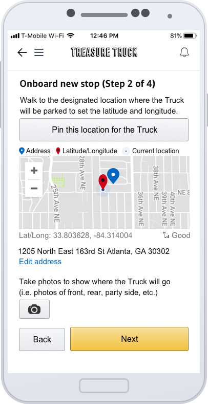
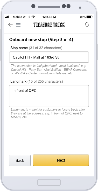
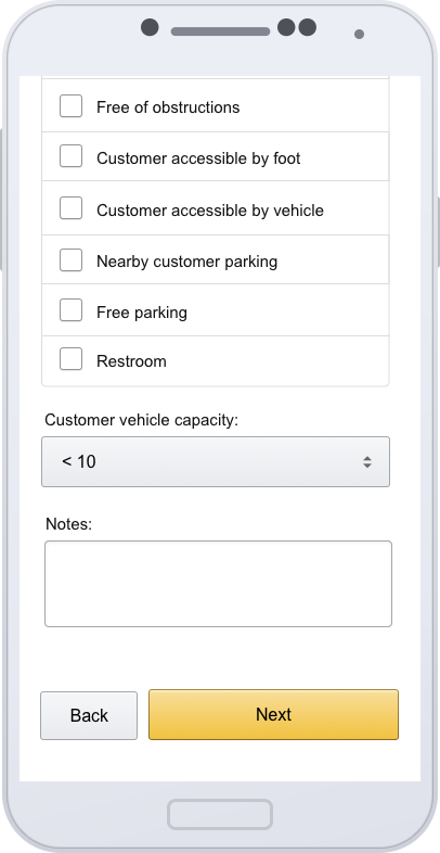
After analysis and a lot of discussion, the onboarding process in Truck App consist of 4 steps. The first step is to check whether a stop location is accessible for the truck and whether it’s safe for our customers. If no to either question, the stop will be submitted to Real Estate team for rejection. If the real estate team find new information from the vendor, they can send the stop back to field team for revision. If “Yes” for both question, the field team will continue to step 2 to 4 to set latitude and longitude, input the stop name and landmark and answer a series site survey questions. The below showing a few different design we tried on the way.

Design 1
Design 2
Design 3
After a lot of interview, usability study and design iteration, the final design of Truck App stop onboarding has been implemented.
06 Result
After the design improvement, the field team error inside Truck App, such as fulfillment without scan and accidentally cancel stop never happen again. The design for Stop onboard got very positive feedback from the users and the leadership. The next step is to integrate a better permission control and messaging system inside the Truck App.