Visual Studio Breakpoint Experience

01 Background
Visual Studio is fully-featured integrated development environment (IDE) for Windows, Android, iOS, web, and cloud. Visual Studio provides the most powerful and feature complete development environment, bar none. Its complexity is intimidating and the framework it’s built on presents challenges akin to moving mountains just to make the slightest change to any of its components. Visual Studio has 4 million users with 1.5 billion revenue per year.
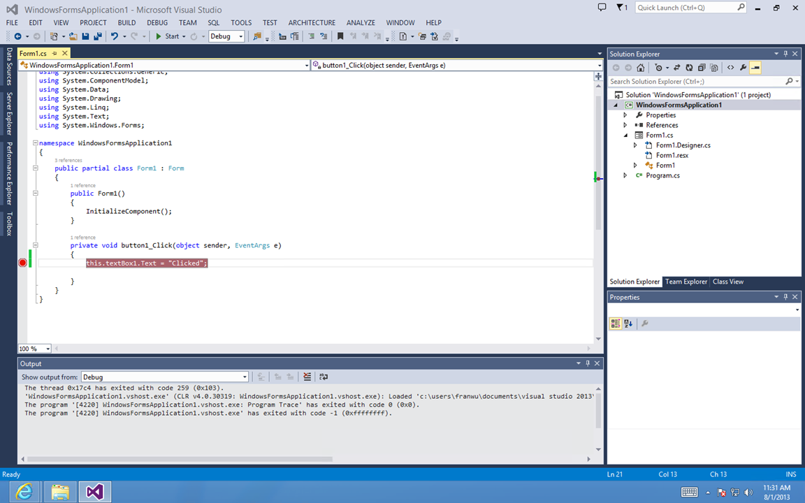
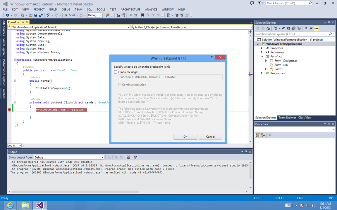
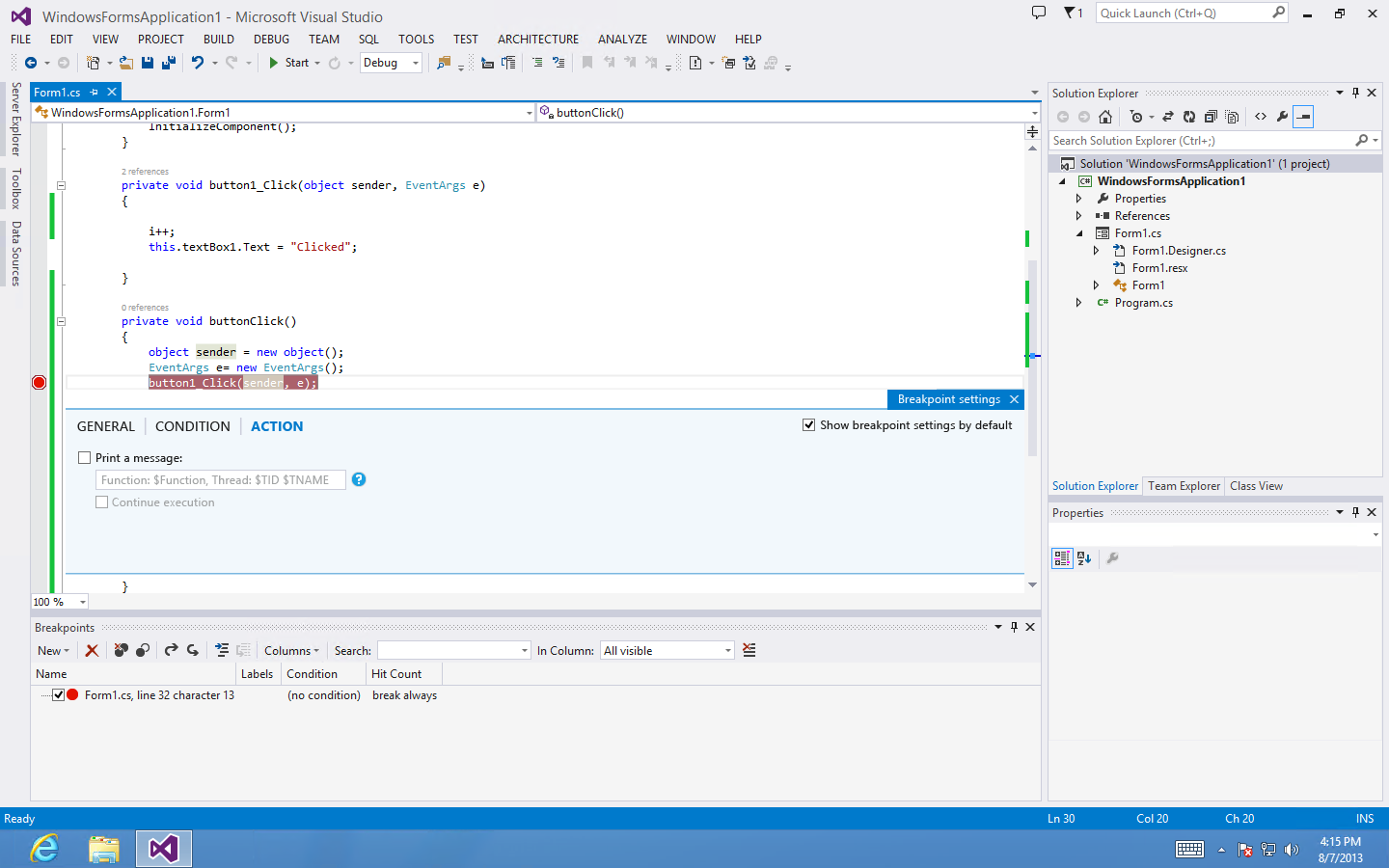
A breakpoint is a signal that tells the debugger to temporarily suspend execution of your program at a certain point. Breakpoints provide a powerful tool that enables you to suspend execution where and when you need to. Rather than stepping through your code line by line or instruction by instruction, you can allow your program to run until it hits a breakpoint, and then start to debug. This speeds up the debugging process. Without this ability, it would be almost impossible to debug a large program.
COMPANY
Microsoft
TIME
2015-2016
ROLE
Lead Designer
The problems of current experience
The slideshows on the right clearly demonstrate the top problems for current breakpoint experience.
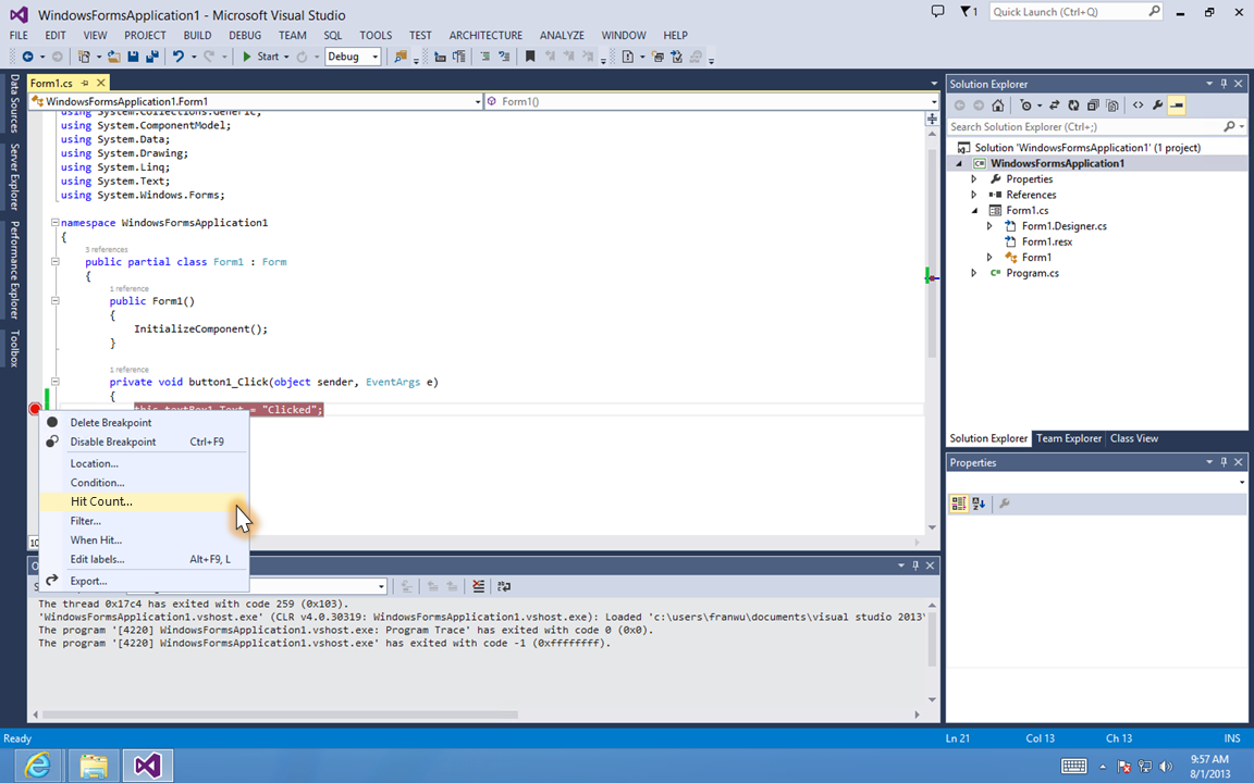
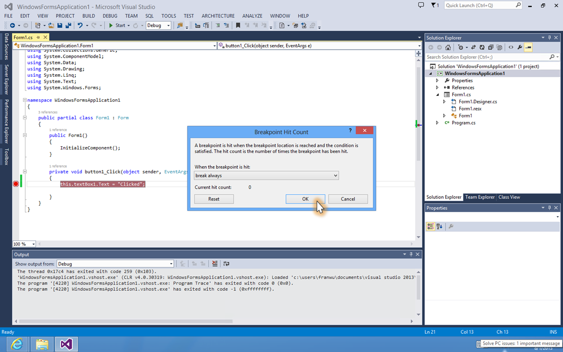
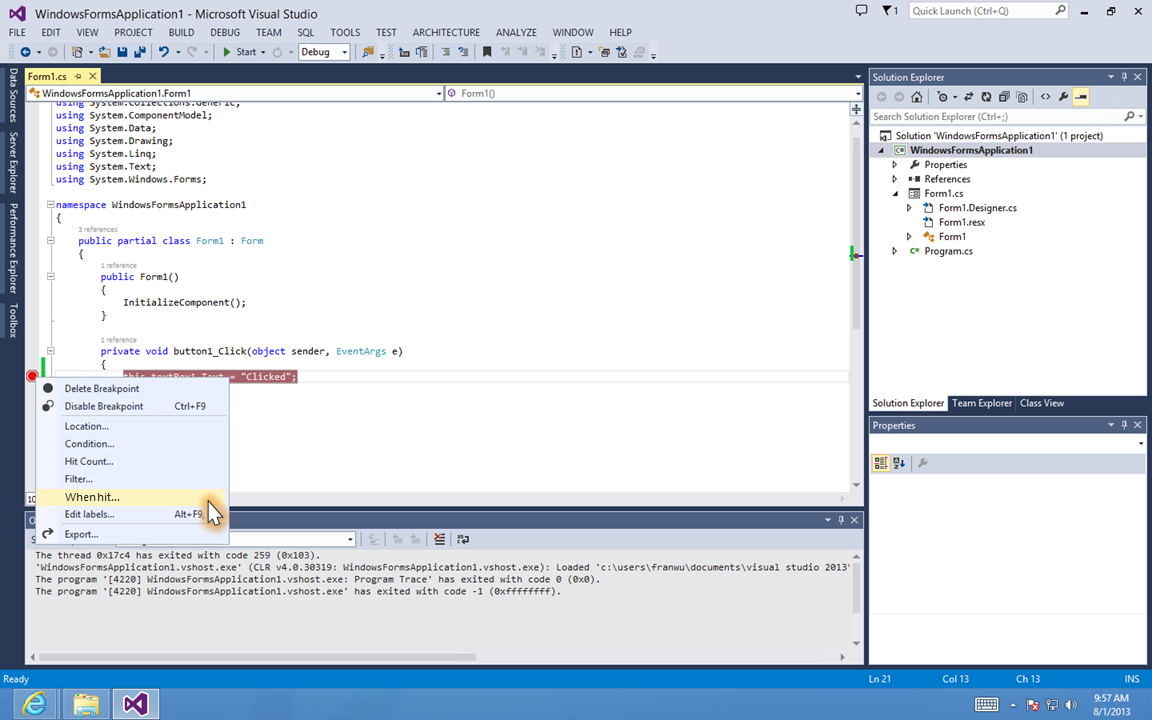
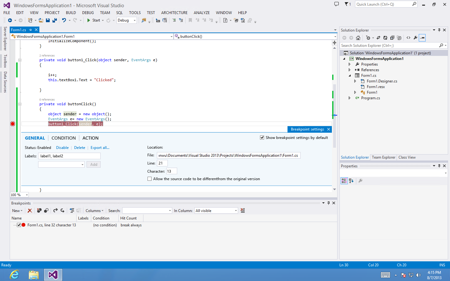
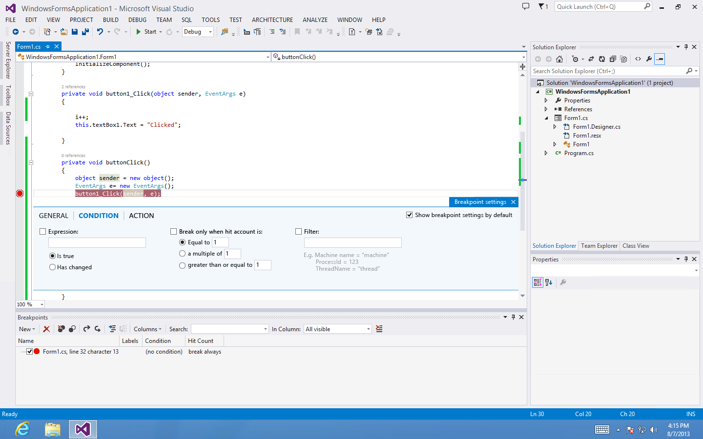
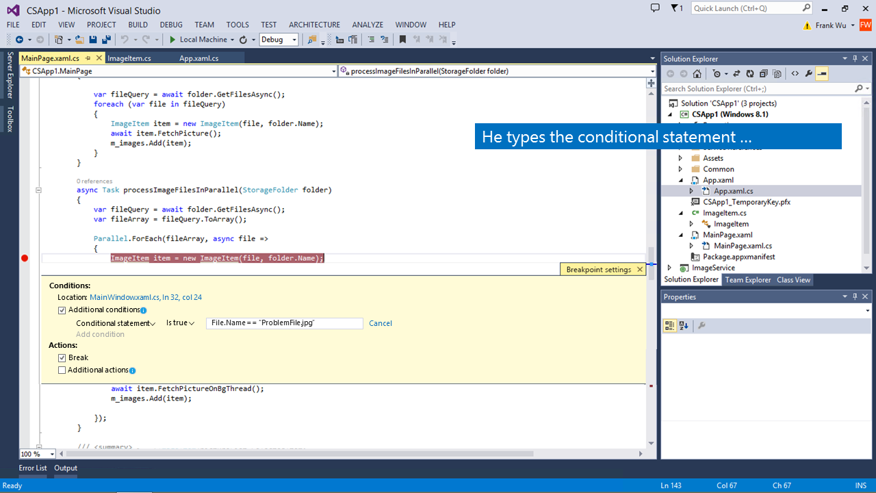
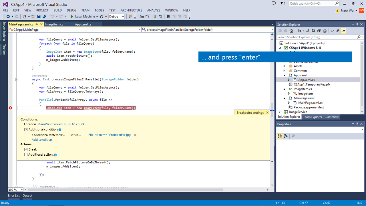
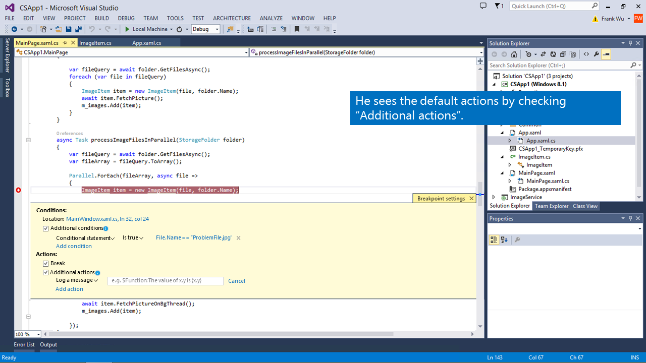
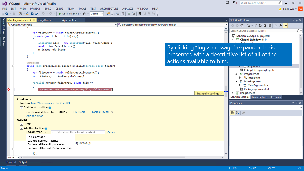
- It’s difficult to set up multiple conditions and actions
- The popups are modal and cover the most important code
- The advance features are undiscoverable
- Only 0.8% users use advanced breakpoint
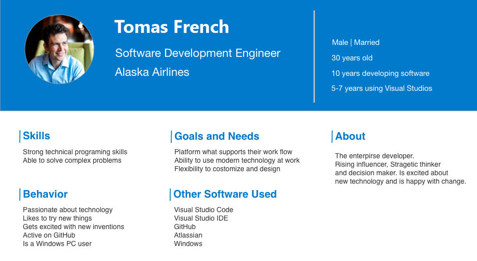
02 Target user and design goal
Target Persona
The design goal
“Make the breakpoint experience more usable, discoverable and extensible”
03 Sketching and Wireframing
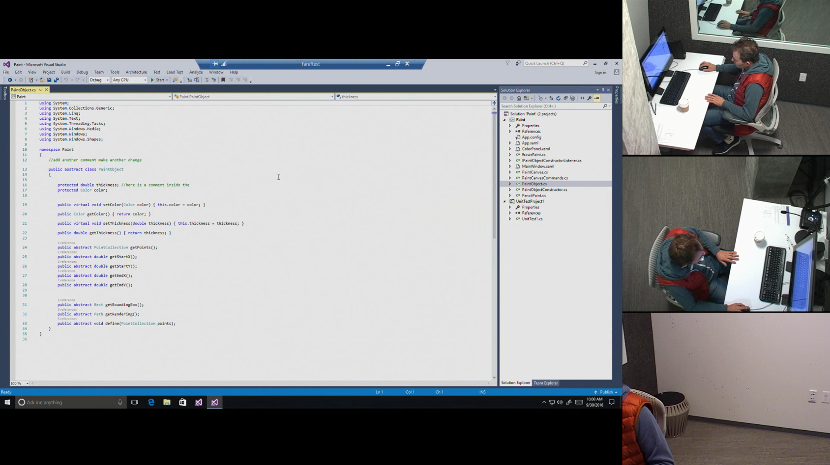
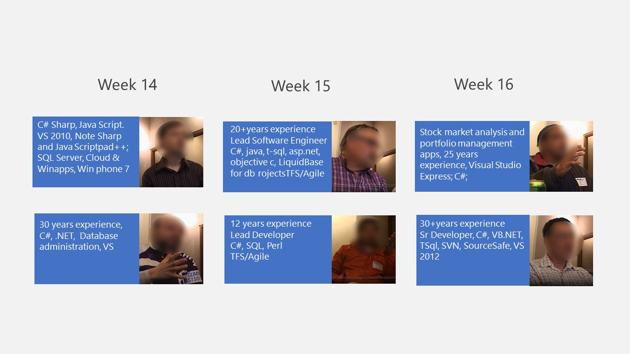
The designer, researcher, PM and engineer team had a series of brainstorming for future breakpoint experience. We came out plenty of early ideas. Each week we invited two users to our usability lab for quick pulse study. I iterated the design based on the research result we got each week. Then we tested it again. If one idea is bad, we just throw it. If some part of the design ideas are good, I made quick improvement to the not-so-good part. We do design/test/learn iteration. We are continually learning and improving. Until, we found a solution both our users and all stakeholders love.
Early idea 1:
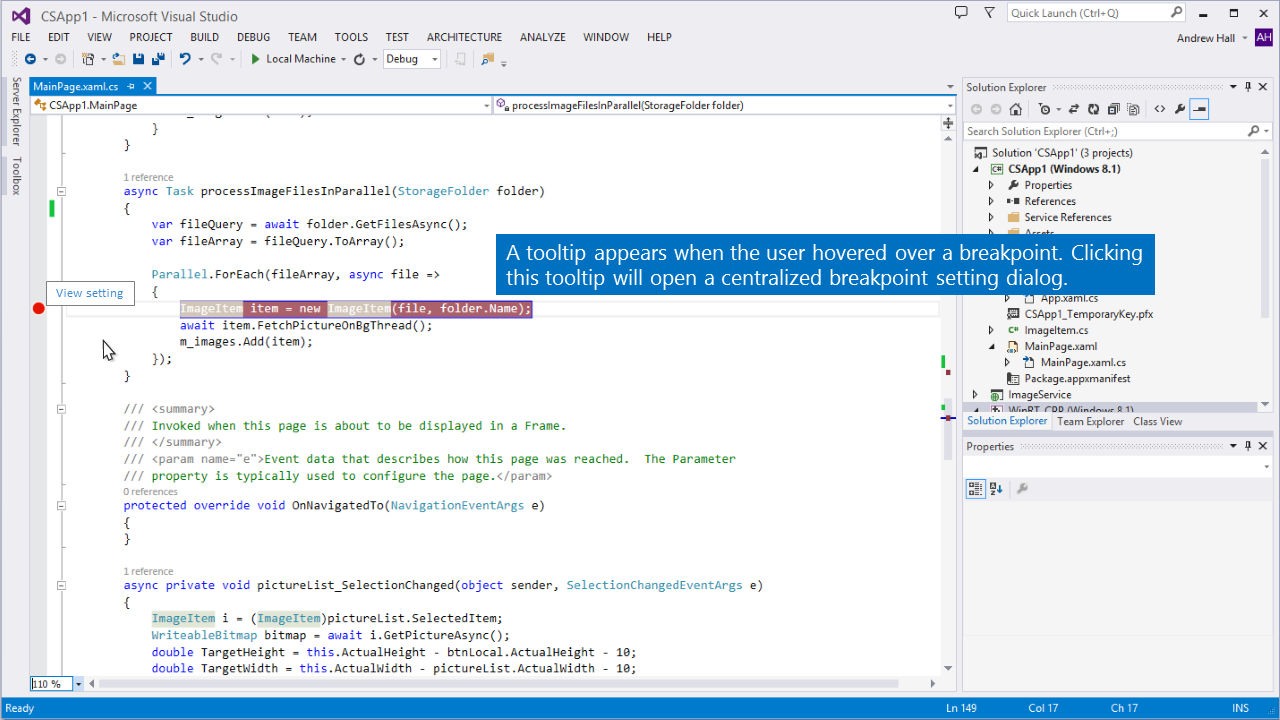
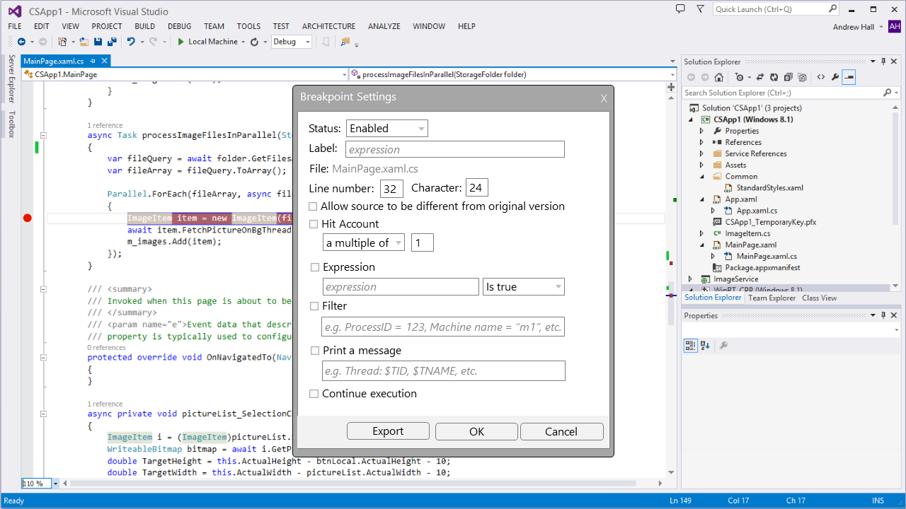
The below is the idea which I tried in early stage. This design tried to solve two problems: 1) right click doesn’t have good discoverability and not so easy to use. 2) there are way too much pop ups. In this design, a tooltip with a hyperlink inside will show up when the users hover over an existing breakpoint. Clicking the tooltip will show a centralized setting dialog which let the users to configure all conditions and actions.
Early idea 2:
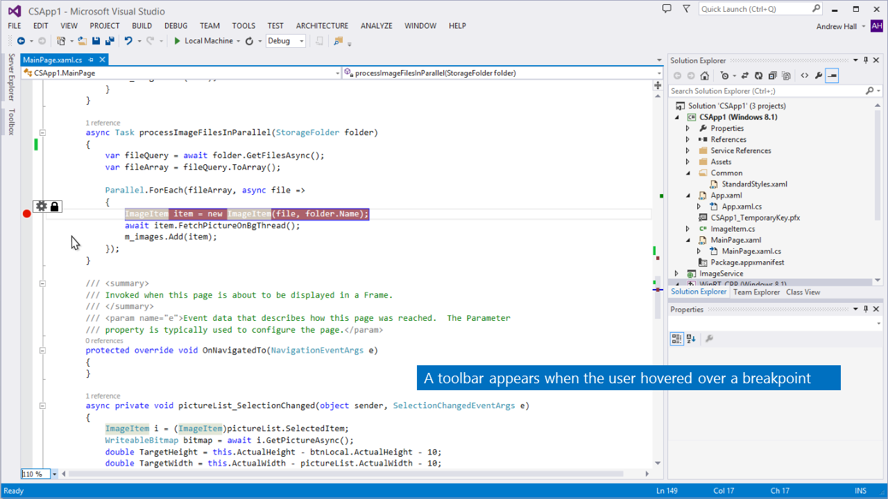
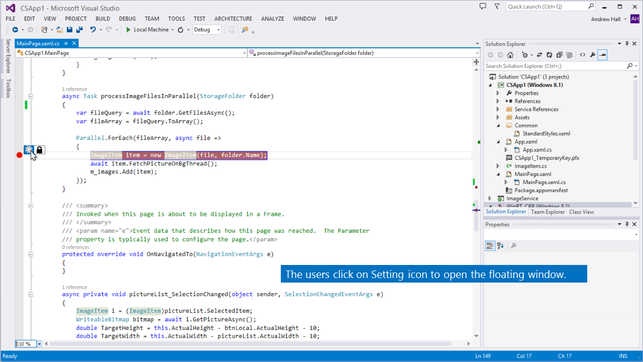
This is one of the early ideas I tried. A toolbar will show up when the users hover over an existing breakpoint. Clicking setting icon in the toolbar will show a floating window which let the users to configure the breakpoint’s condition and action.
Early idea 3:
Overall, this design test well in quick pulse study with two big issues: 1) the discoverability of this design is still not good enough. Most users don’t think they will hover and discover the menu. 2) the users don’t like pop up on top of pop up. After further discussion and brainstorming, I came out early design 3 to address these two issues.
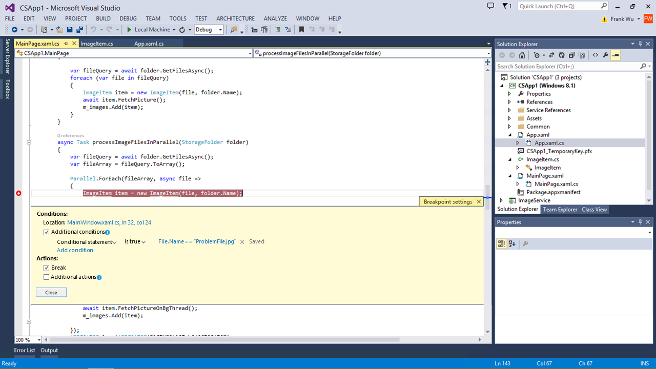
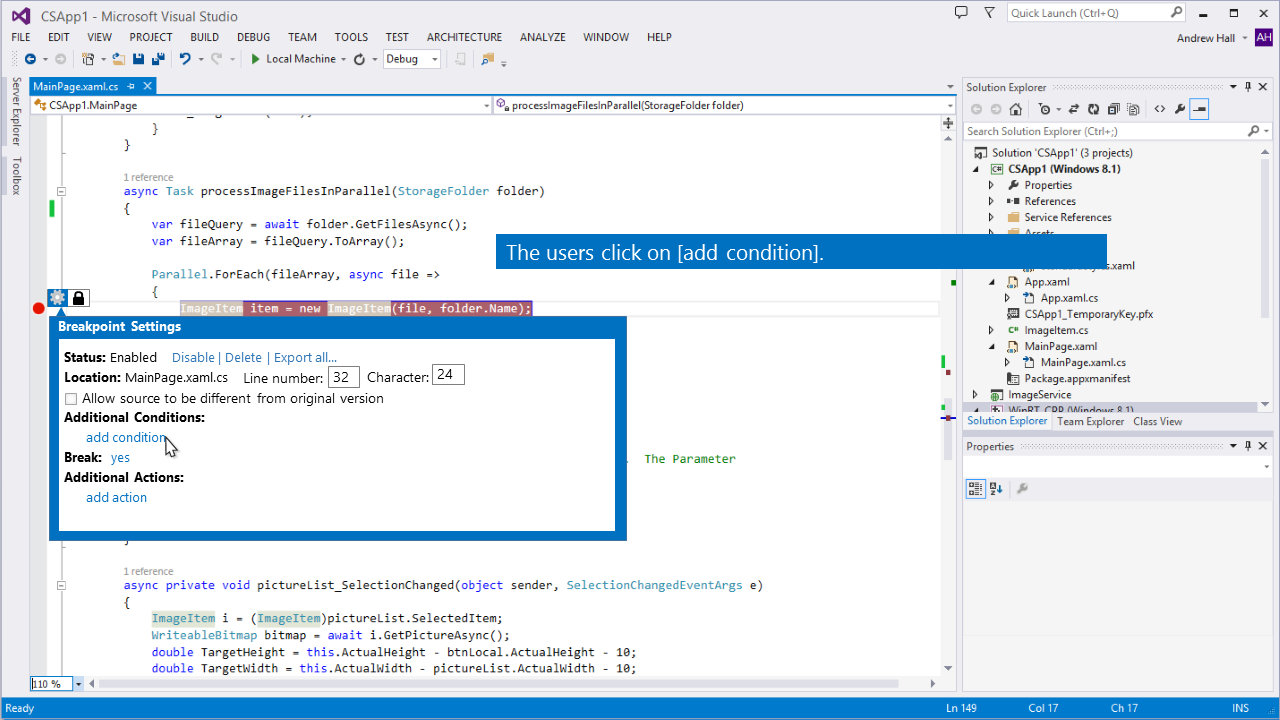
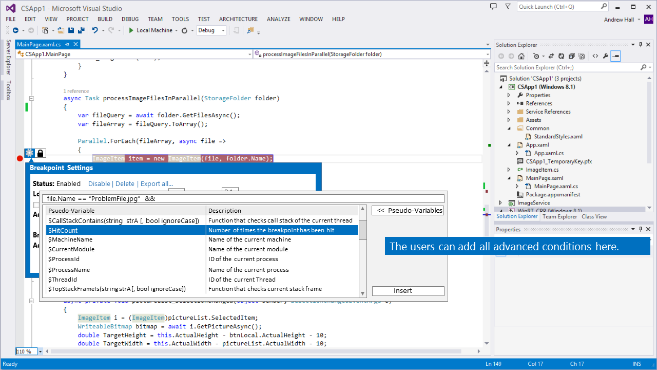
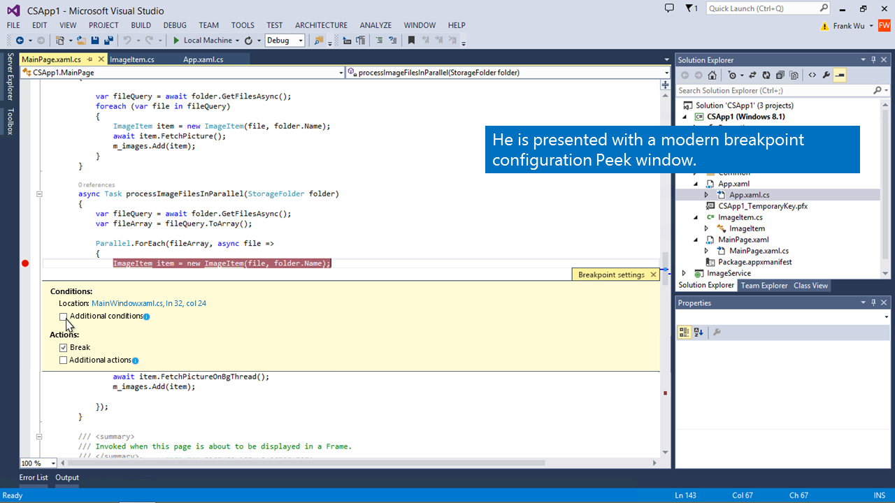
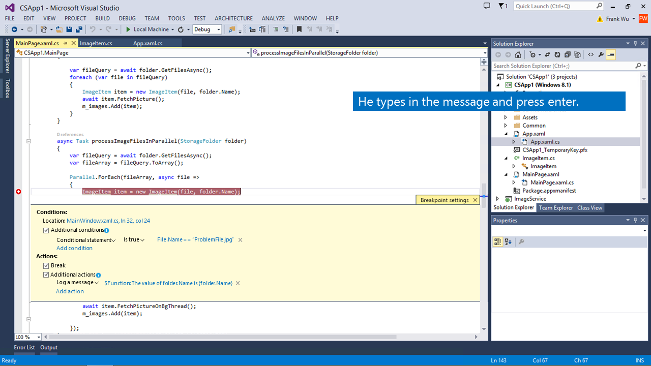
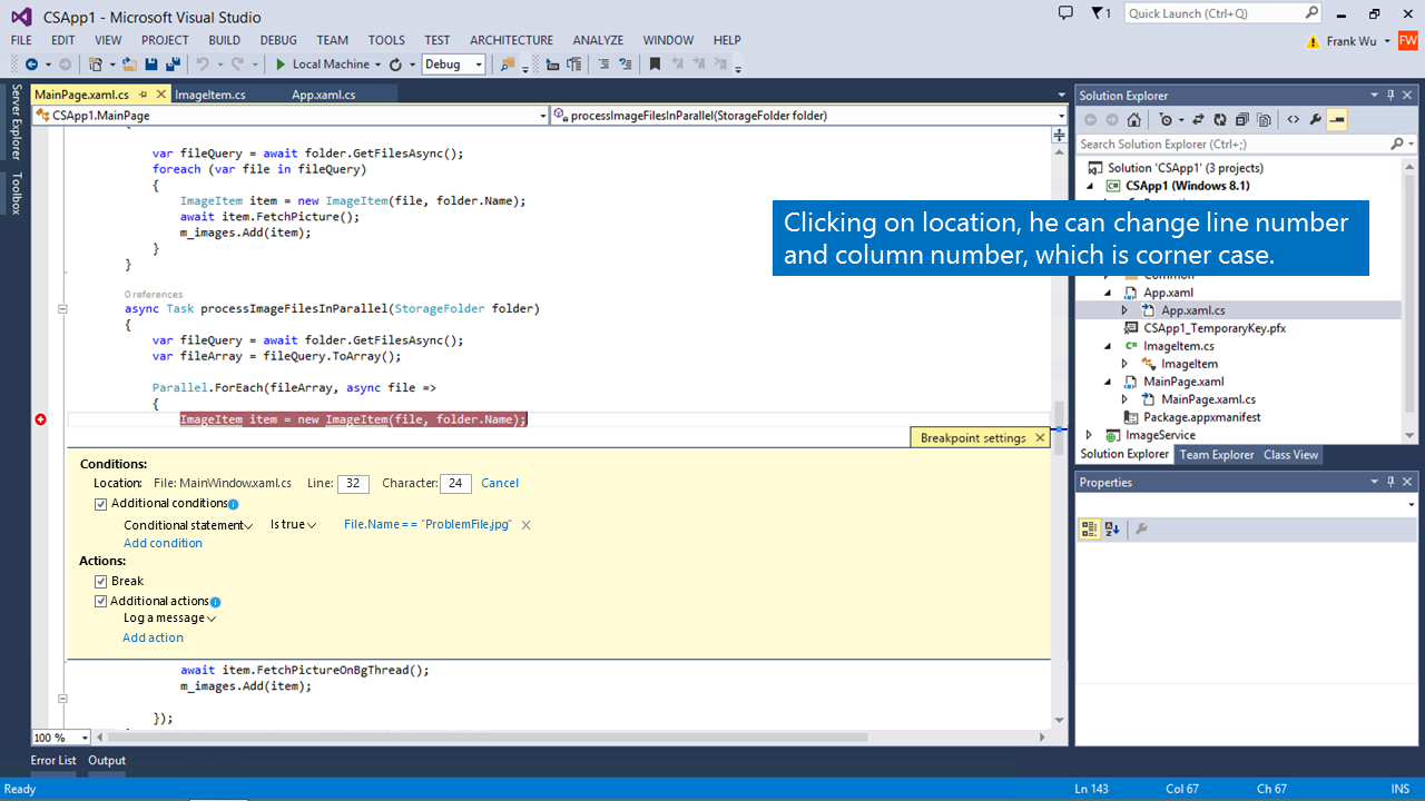
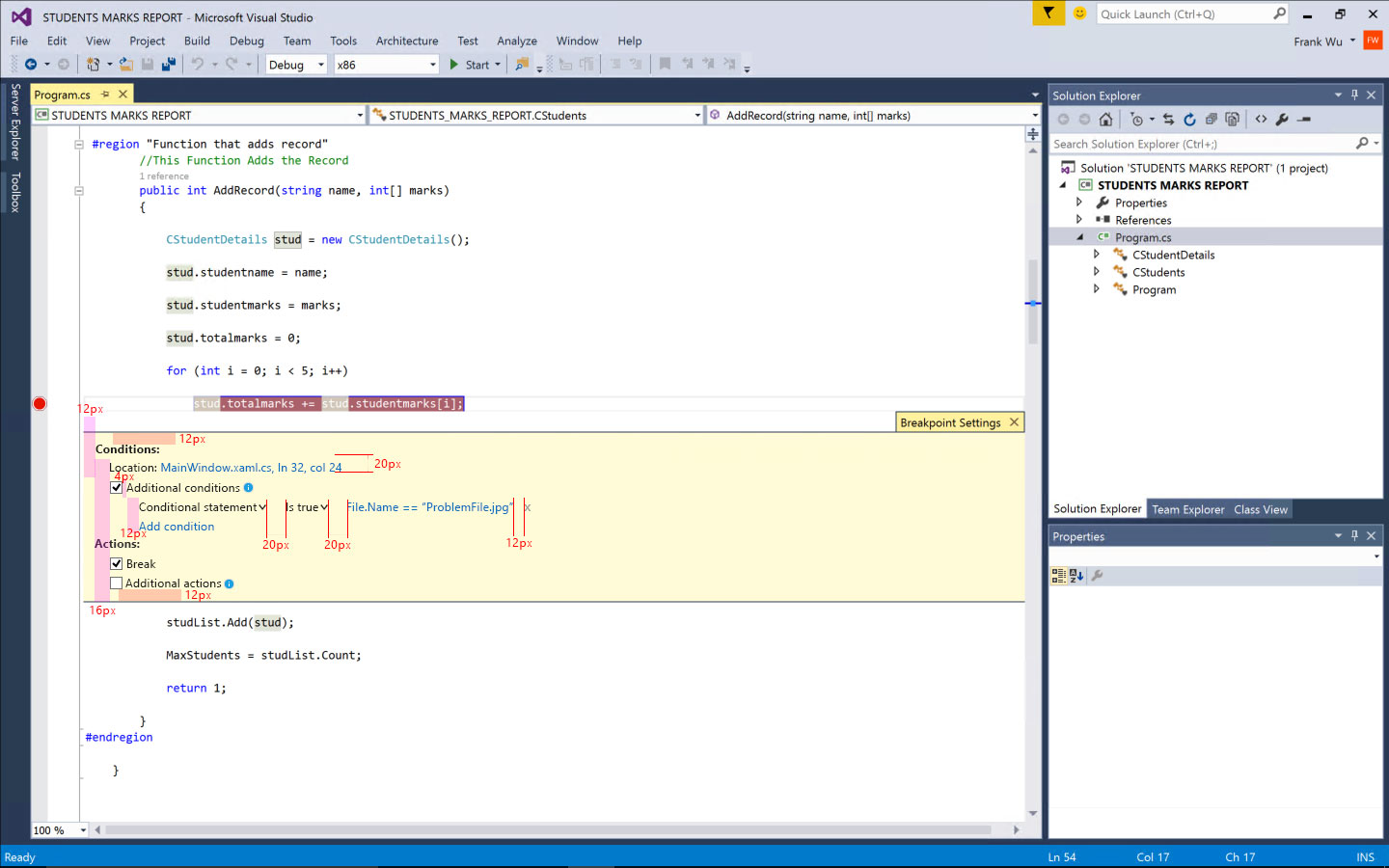
In this design, I fully remove all pup-ups. Instead I use embedded window inline to show the conditions and actions, which we called Peek Window. This peek window will be shown by default after the users set a breakpoint. The users can uncheck the checkbox on the top right corner inside the peek window to turn it off. The main part of this peek window have three tabs: general, condition and action. The users can configure all conditions and actions all in one place.
The quick pulse test result for this design overall is positive. But some users have concern about showing breakpoint setting window by default. So I continue iterating designs based on the feedback.
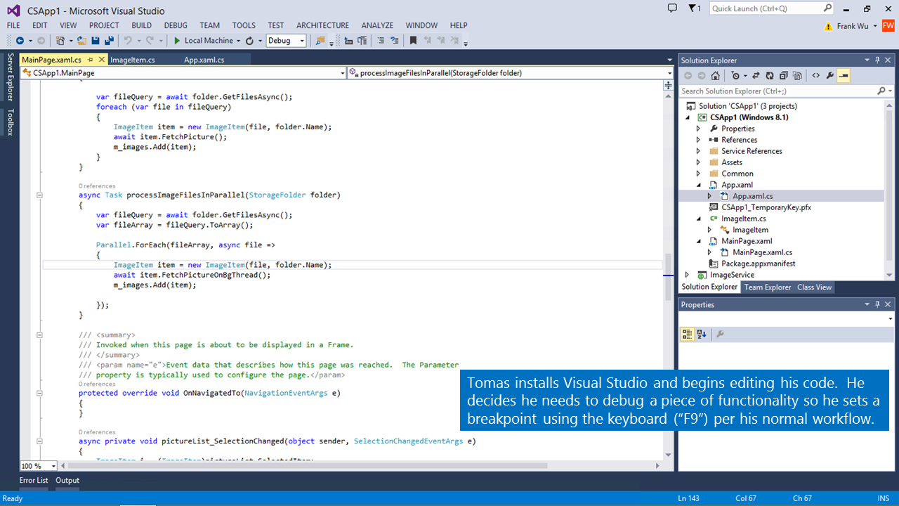
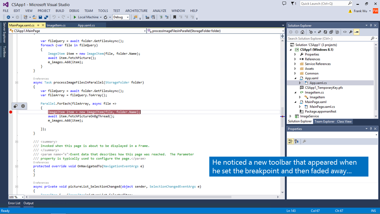
04 Final Design
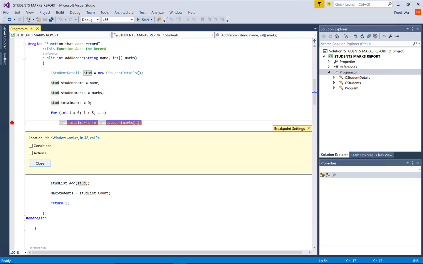
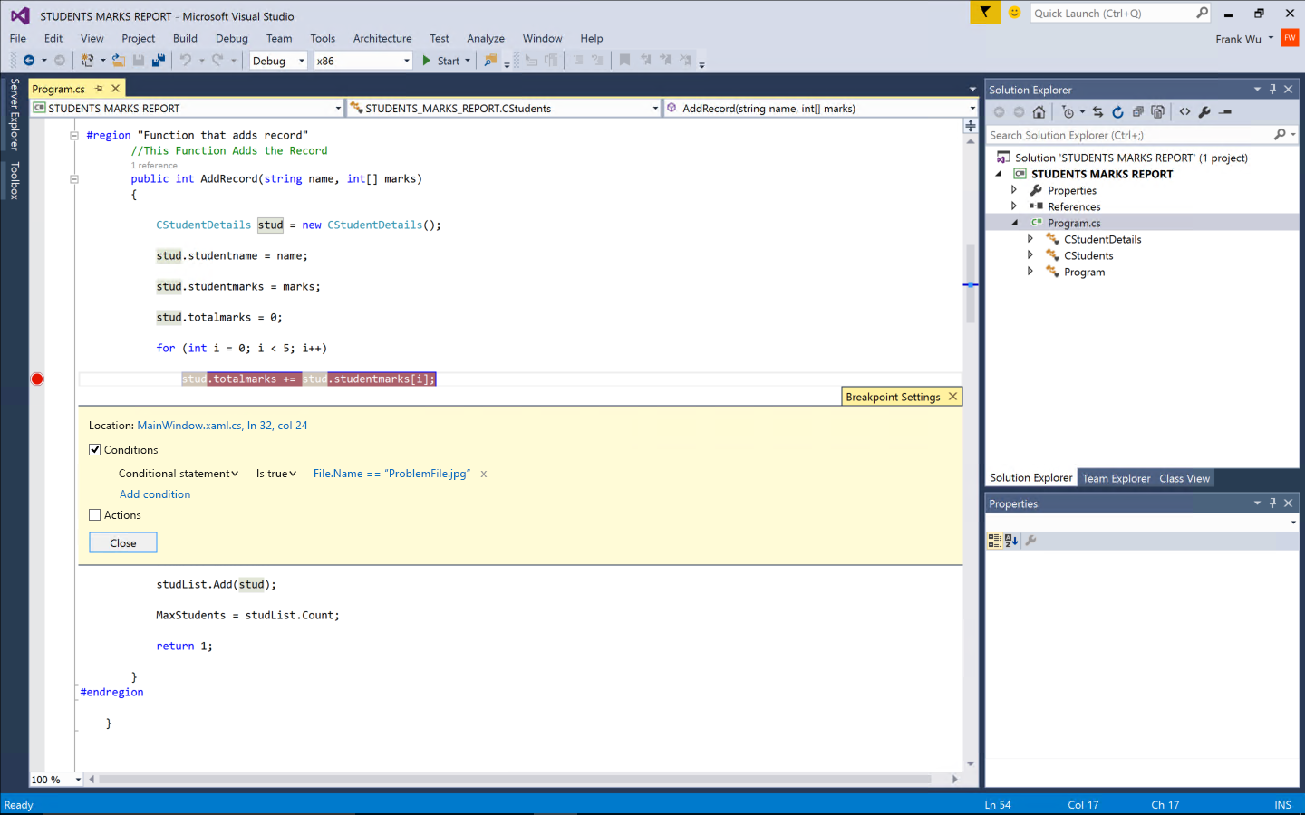
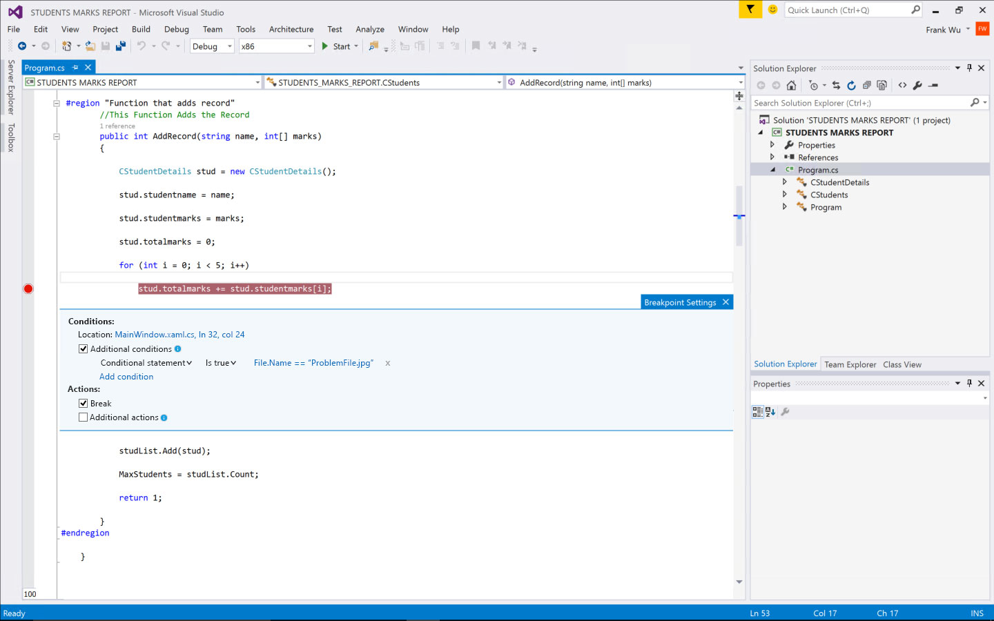
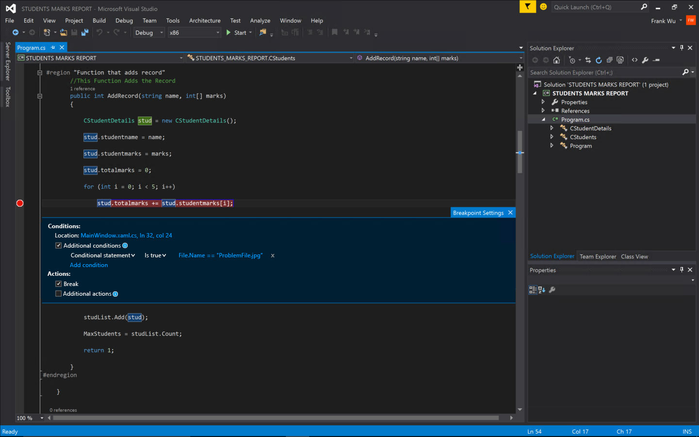
In the final design, I no longer show the breakpoint setting window by default. Instead, once the users setup a breakpoint, an floating toolbar will be shown. The toolbar will fade away after 1.5 second. We tested different time span for fade away. 1.5 second is a nice balance that it will get the users’ attention without annoying users. Also, I changed the three tabs design in early idea 3 to a much simpler design, which make it easier to configure both conditions and actions.


Themes and redlines
Visual Studio have three themes: Blue, Light and Dark. The default theme is Blue. The mockups above all used blue theme. When I created the redlines and visual spec, I also need to consider how the feature look in different themes, and chose colors working for multiple themes.
After I finalized the design, I also created final deliverables like redlines and shared with the engineers. I scheduled a meeting with the engineering team to walk them through the design and answer any questions they had. I also reviewed the ongoing implementation regularly to ensure the right experience is being built.
05 Result
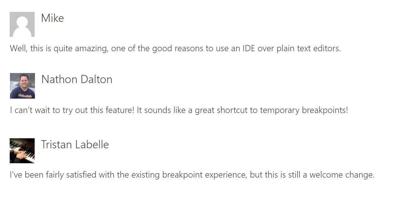
After releasing this feature, we got very positive feedback from the users. The below are some examples. Also the design goals which I set in the beginning have been achieved. The users who use advanced breakpoint increase from 0.8% to 7.2%, which is 9 times more.
What should be improved?
After releasing the feature, we also received some suggestions from our customers besides the positive feedback. The top two issues are 1) it’s not easy for the users to close the breakpoint setting window 2) the users are not sure whether their changes have been saved after they updated the conditions and actions.
I made UX improvements in the update to address these concerns. I added a “Close” button the breakpoint settings. We tried other ways, such as “OK” “Cancel” button, or keyboard shortcut hint. The “Close” button worked best. The current commit mode is “instant saving”. I tried to switch to click “Save” button to save the changes. But the users still prefer instant saving mode. They just need a visual feedback to be more confident that their changes have been saved. So I added a grey text hint “Saved” in the end of the line after the users made some change. I also further simplified the UI. The customers are happy with the changes in the update. The below are the updated design.